Your Guide to Responsive Design for Credit Union Websites
In recent years, responsive design has become table stakes. Visitors expect that your website will look great across a variety of devices and screen sizes, which means the design maintains text readability, adjusts image sizes, and allows menu functions to work intuitively so visitors can enjoy a high-quality user experience whether they're at their desk or out in the world.
Obviously, responsive design is important to your bottom line — you don’t want visitors jumping ship before they click on that “Apply” button because a webpage is difficult to read or navigate — but there are values-driven reasons for prioritizing it, too.
Responsive design helps make you website accessible to all members, regardless of their technological preference or ability, aligning with the credit union ethos of serving diverse communities and promoting equitable access to financial services.
Prioritize device optimization, not just mobile
It’s trendy these days to talk about a “mobile-first” approach, but we don’t actually recommend this. Mobile-first websites often offer poor or inferior desktop experiences, and the majority of credit union website visits are still from desktop.
For example, the so-called “hamburger menu” (three stacked lines) is a key component of an optimized mobile experience, as it takes up limited space and allows users full access to the navigation menu. However, on desktop, it makes more sense to take advantage of the horizontal space to display the navigation labels, without requiring visitors to click into the menu.
Your website should be optimized for all common screen sizes, which means taking into account the real estate you have to work with, the effort you’re requiring of your visitor to navigate the site, and page load times across devices.
Use flexible grid layouts and scalable images
A flexible grid layout, which involves using relative units like percentages instead of fixed units like pixels, allows your website to adapt smoothly to different screen sizes. That means your design will automatically resize to the screen size of the device through which a visitor is accessing your website. You don’t have to worry about headers getting cut off or overlapping design elements. Similarly, scalable images adjust to the size of the user's screen, maintaining their quality without slowing down the site.
Prioritize content
Content prioritization is crucial in responsive design. On smaller screens, it’s important to display the most critical information first. For credit unions, this includes the login button to your online banking platform, which shouldn’t be hidden in your navigation menu but rather prominently displayed at the top of all pages.
You also want to make sure that your primary call to action doesn’t get pushed off the page by a decorative hero image. You can keep the image, but make sure it stacks below, not above, your page title and CTA. In some cases, it might be more prudent to hide images from the mobile view altogether. Maybe they help enhance a desktop page but simply require too much scrolling on mobile and your users would be best served by getting to important information sooner.
Optimize third-party tools & integrations
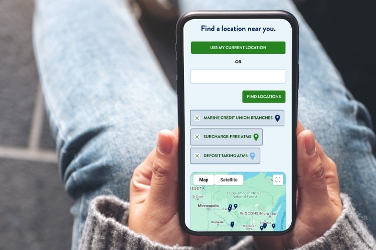
When engaging with your online tools, it’s important to remember that visitors may have different intentions depending on the device they’re using. For example, a visitor looking up ATMs from a desktop device is probably doing research to inform a future outing, while a visitor looking up ATMs from a phone may be actively looking for an ATM to visit at that very moment. A simple “ATMs near me” button on the mobile version of your ATM finder could save them the hassle of multiple clicks while they’re on the move.
When evaluating any third-party tool to integrate with your website, be sure to explore the integration across devices.
Test rates & comparison tables on mobile
Credit union websites often contain multiple rates tables and comparison tables that are best suited to wide screens. You’ll want to make sure these display in a logical and coherent way on mobile devices, meaning that the information is both legible and corresponds to the correct column and row headers. Mobile visitors may not get the benefit of seeing certain rates or product types compared side-by-side, but they at least need to know which rate or benefit corresponds to which product.
Evaluate animated elements
While animations should be used sparingly across devices, you’ll want to be especially judicious about them on mobile. Make sure they serve a clear purpose, such as highlighting important information or guiding a visitor to a next step. Remember that not all animations translate to mobile — for instance, hover animations — so if these are an important part of your user experience, you’ll need to find an alternate way to recreate the experience on touchscreen devices.
Related resources
UX Best Practices for Credit Union Websites
What constitutes a “friendly” user experience on a credit union website? We'll explore five key best practices.
How to Build Trust & Credibility with your Credit Union Website
Your website represents a primary touchpoint for many prospective members. Don't scare them away!
Inclusive Design: Why Your Most Vulnerable and Stressed Out Members Should Come First
How can you create a truly inclusive digital experience that doesn’t alienate your most vulnerable members?
Conclusion
Responsive design is more than just a technical requirement; it's also an opportunity for credit unions to make their products and services more accessible. Not only that, optimizing your user experience across devices can lead to more conversions and more opportunities for both members and prospects to have positive interactions with your credit union.
Let's talk!
Is your credit union ready for a website redesign?